How to think about the impact of Currency on a Portfolio

This article was written with Chris Shuba and Joe Mallen of http://heliosdriven.com/  And has appeared here in ETF Trends


When considering how currencies affect US $ portfolios, one must think about four things:

  • Buying a foreign currency asset is a bet that the US $ will decline.
  • The longer-term contribution of currencies to portfolio returns and volatility can be substantial.
  • Some currencies have hidden regime jumps or shock risks.
  • Will the US $ decline or rise the currency you invest in.

First, quite unlike stocks or bonds, currencies have no inherent value, only relative value, and when you make a relative value investment, you bet on one instrument rising more than another. That is because a currency only has value relative to what it can be exchanged for, whether that is the Japanese Yen, Gold or Bitcoin.  Thus, putting money in a foreign currency means that you are implicitly expecting that currency to rise relative to the dollar, or for the dollar to fall relative to the currency that you bought.

For example, when you buy a broad non-US ETF like JPMorgan Diversified Return International Equity ETF (JPIN), you assume that over time a diversified basket of global stocks will rise, and simultaneously assume that the US $ will fall in value.  The changes in both the portfolio of stocks and the portfolio of exchange rates affect your $ PL.  In the example given, let’s say it’s a global stock market holiday and every equity market in the world closes for a 4 day weekend, but the currency markets remain open.  Over that long weekend, the value of the stocks in JPIN will remain unchanged, but a 3% decline in the value the US $ relative to the currencies in the ETF will cause the value of your investment in JPIN to increase by 3% in dollar terms.

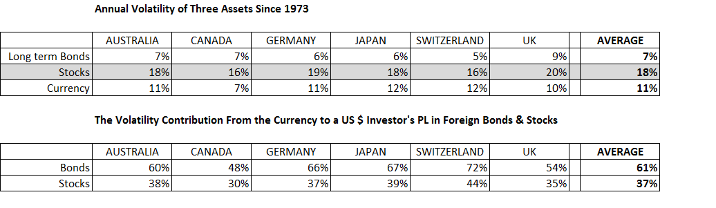
Second, while one might not think that exchange rates contribute to a long-term investment in an asset in another currency, the fact is they do.  Consider the table below, which shows the annual volatility of the exchange rates of several countries vs. the US $, as well as the annual volatility of long-term bonds and stocks in the same country.

As you can see in the first table, Annual Volatility of Three Assets Since 1973, on average, the annual volatility of long-term (10 year) bonds in major developing countries has been about 7% vs. 11% for the currency.  For stocks, the average annual volatility has been 18% vs. 11% for the currency.   However, it is the second table, The Volatility Contribution From the Currency to a US $ Investor’s PL in Foreign Bonds & Stocks, that tells the real story.  On average, 61% of a US investor’s foreign bond PL is determined by changes in the exchange rate, with only 39% coming from the performance of the bond itself.  That is the majority.  So, if you buy foreign bonds, it makes sense to hedge.  With stocks, more than a third or 37% of a US investors PL is driven by the currency change.  Put another way, 37% of your foreign stock PL is being determined by a factor that is extremely hard to predict.

Third, currencies occasionally make large, unexpected moves.  These large changes are usually a currency devaluation relative to the US $, though not always.  Latin American currencies, in particular, have a long and colorful history of dramatic collapse.  Devaluations naturally cause a US $ investor to lose money on the currency part of their investment.  Also, devaluations are usually inflationary and negatively impact holdings of local bonds, because local interest rates typically will rise.  The impact of a currency shock on local equities is not always as predictable.  Stocks that are highly dependent upon local or foreign currency debt, fall as rates rise and their foreign debt obligations increase, but an export company with little debt will likely see its share price skyrocket because the firm is now internationally more competitive.

For US investors, currency shocks are not always an emerging market issue.  In the last few years, the UK and Switzerland have both experienced significant sudden changes in their currency value, because of the Brexit vote and an abrupt change in Swiss Central Bank policy.  Should Denmark suddenly decide to uncouple the Krona from the Euro, or Hong Kong or China decide to make their currencies more free-floating, there would be massive changes in the exchange rate.  These large potential changes in currency value, whether in emerging markets or the developing world are something investors need to be aware of.

Finally, one must consider the future direction of the US $. If it declines, foreign currency investments gain in dollar value, and if it rises, these same investments decline in dollars.

On the one hand, the US $ has some major pluses.  For now, at least, it remains the world’s reserve currency.  Our relative geographic isolation means the US is where funds typically come in times of geopolitical trouble.

US growth is strong relative to much of the developing world, which makes it attractive to capital seeking higher growth rates.  And, the US Central bank is raising rates, so it is attractive from a relative interest rate perspective.

On the other hand, the US $ has declined a great deal vs some major trading partners over the last 40 years.   In the 1970s, a dollar bought up to 360 Yen; now it buys 110.  In the late 1980s, one US$ could buy 10 and even 12 Renminbi on the black market; now a dollar buys 6.5 Renminbi.  Over the long-term, countries with high savings rates and current account surpluses tend to see their currency rise relative to countries with low savings rates and large current account deficits (who must fund their spending by importing capital from abroad).

The US Current Account is still in the red (though much smaller than several years ago), and US savings numbers have improved.  That said, remember that currencies are a relative value investment.  Compared to thrifty East Asia, the long-term US numbers are not as attractive.  The fundamentals for the rest of the world relative to the US are not as crystal clear.

The US currency is also affected in the short-run by both current political policy and the business cycle.  Trade wars and ballooning public deficits don’t inspire confidence among foreign investors.  And if foreign investors choose to keep their money at home, it would cause the US $ to decline and US interest rates to rise.

Inflation and higher interest rates are the other related factors that will impact the US $ in the near term.  As noted above, higher relative interest rates and relative growth rates have attracted foreign capital to the US.  But if there is the perception that these higher rates of growth and yields are being eroded by uncontrolled inflation, and that the Federal government cannot control its spending and the Fed is behind the curve, foreigners will reduce their US investments.  Inflation, when it is perceived to be too high, will cause a currency to lose value, because it destroys purchasing power.  Unfortunately, trade wars as well as a decline in the US $ can further exacerbate inflation by making imports more expensive.  To date, we have not seen a run on the dollar or inflation reach a dire tipping point that would drive interest rates up and asset values down, but the probability of this happening has increased.

Will the next 40 years look like the last 40 years for the US $?  No one can know for certain.  However, in a future post article, we will show how this gradual decline in the US $ has been one of the major benefits US $ investors have gained in the past by putting their money to work in foreign equities.


Timing the S&P 500 Since 1950

Market timing is hard.  In fact, there are very few strategies that have historically beaten a buy-and-hold (B&H) index strategy.  The simple strategies that do appear to beat buy-and-hold do NOT have a lot of sample size, so they better be logical to you.  As we will show below, there are two simple strategies that do offer above average market returns for an investor historically, but they don’t come around every day.

For reference, the average 10 year annualized return for the S&P 500 has been 6.94% since 1950.  That is our benchmark.

Our timing strategies fall into two camps.  First, buy large declines, a mean reversion strategy predicated on the belief that a decline in prices is a great value opportunity.  Second, only buy when the market is making new highs.  If you look at the table below, you can see that neither strategy by itself is particular effective, or beats B&H until you start using more extreme versions.

Buying the stock market when it is making all-time highs produces inferior returns relative to buy-and-hold.  It works only if the market has NOT made an all-time highs in the prior year.  But since 1950 this set of conditions has only occurred 13 times.  That said, this strategy has produced 94 basis point of excess return over B&H.  It’s also somewhat logical when you consider supply and demand.  If the market just starts making new highs after a prolonged period of sideways or downward movement, there are enough people who still have not bought in yet.  There remains some market capacity to discount future positive events.  Not everyone is bullish yet.   It also is a strategy that means you are not likely to invest right before financial Armageddon, though there is obviously no guarantee.

By contrast, buying declines in the market has worked only when you get really large declines.  If the market declines 25% or 35%, you do not beat buy-and-hold.  Buying any of the 52 days that the S&P 500 declined more than -45%, has produced 10 year returns that are only 11 basis points better than B&H.  Its only if you bought on the 4 days in the last 7 decades that the market declined more than -47.5% that you really do much better than buy-and-hold.  That’s once every 17.5 years, so be prepared to keep your powder dry a long time.   This strategy also needs to come with the caveat that the few times it doesn’t work can be painful.  Using this in Japan in the 1990s or in the US during the 1930s would not have worked.  Markets don’t always mean-revert.  Just because something has gone down -47.5% does not mean it can go down another 50% or more.

An Update on the Selling Volatility Overnight Anomoly

The charts below pretty much speak for themselves.  Selling volatility intraday has been a path to the poorhouse.

While selling volatility overnight through the recent storm has been a bit painful, your positive PL for the last 14 months remains healthily intact.

By contrast, selling vol intraday has been a good path to bankruptcy.

The lesson: if you can sell vol on a short-term basis, do it overnight.

Some Long-term Trends in Corporate America

The levels data from the US Flow of Funds has some fascinating information about the behavior of the major sectors of the US economy.  Today we are going to take a quick look at some of the longer-term secular trends that have affected US non-financial corporations (meaning no banks, insurance companies etc. included).

First, let’s look at the slow change that has happened in the way that US corporations borrow now vs. yesteryear.  From 1960 until about 1990, corporate borrowing was pretty well balanced between issuing debt (via bonds, notes or paper) and bank loans—a number above 100% indicates corporations borrowed more from loans than by issuing debt, a number at 100% means the two were equal financing sources, and a number below 100% indicates debt issuance exceed loans.  Since 1990, corporations simply stopped bothering going to their bankers to ask for a loan with the same frequency.  We now live in a world where corporations actually borrow 2/3 rds of their funds by issuing debt, and derive only about a third from loan financing.   Three Martini lunches over golf with commercial bankers have been replaced by abstemious and heavily regulated meetings with investment bankers.

The second secular trend has been the steady inflow of foreign capital into this country.  We hear the headlines about how Asian countries with current account surpluses like Japan and China are huge buyers of US Treasuries.  What we hear less about how foreign direct investment in US corporations has now reached almost 20% of their “liabilities”.  As a refresher, foreign direct investment or FDI means a foreigners either set up a factory or acquired ownership or a controlling interest in US business assets.

To a large extent this gradual uptrend appears to have been related to at the start at least the breakdown of bretton woods and the emergence of a free floating US dollar.  But greater international trade and financial integration has also made it very easy for foreigners to invest in US corporations, which continue to appeal to people overseas.  This a trend that seems to show no signs of stopping either.  The US remains an attractive investment destination.

By contrast, US corporate direct investment abroad does not show the same continuous slope.  Again with bretton woods in the early 1970s you do see a sustained spike in investment outside the US in the 1970s.  But then in 1980s and 1990s only 15% of corporate assets are abroad, as US corporation seems to see better investment opportunities domestically.  Probably because of the economic emergence of China, starting in the new century, corporations have put more money into factories there and in Asia and into acquiring overseas businesses.

The final interesting trend is that US corporations, save Berkshire Hathaway and Apple, simply are not as cash-rich in aggregate as before.  One would think that corporations would show some cyclical variability in their response to investment demand in their asset mix, hoarding a bit more cash when times were tough or the investment future was less certain.  Nope.  For thirty years from 1960 to 1990, cash as a % of assets simply declined steadily, before leveling off around 8% where it has remained roughly since with some minor variation since.

A Look at The Growth of ETFs

The popularity of Exchange Traded Funds (ETFs) started in the early 1990s as an alternative investment vehicle to Mutual Funds.  The first popular ETF, the SPDR S&P 500 (Symbol: SPY) provided investors with inexpensive exposure to the S&P 500 Index.  Since that time, ETFs have grown and grown in usage.  What is interesting is that despite their proliferation, the majority of ETF assets have been and remain in equities, as you can see in the first chart.  For the past decade about 80% of all ETF assets have been in stocks.

The only asset class that has really begun to crowd them out is bonds.

Other investment asset classes and investment alternatives (commodities, currencies etc.) made a decent in-road to total market share from 2008 to 2012 for a period of time, but have since seen their market share decline.

When you look at the market share that ETFs are taking away from Mutual Funds, which on average have loads and much higher fee structures, the relative growth in assets makes sense, especially since many, though not all, ETFs are indexes and not actively managed.   That said, there remains plenty of room for ETFs to take greater market share across all asset classes.  The first chart below shows assets in Fixed Income ETFs relative to Fixed Income assets in Mutual Funds.  Fixed Income ETFs have doubled their market share from 6% to 12% over a five year period, but there is still plenty of market share capacity left.

The same story holds for equities. Equity ETFs are now almost 25% the size of equity Mutual Funds.  This number has doubled over 10 years.

The growth differential between funds flowing into equity and bond ETFs and those flowing into Mutual Funds remains sizable.  Both Fixed Income and stock ETFS are growing 20% faster than Mutual Funds in terms of annual asset growth.

The one area where Mutual Funds still predominate, for the time being at least, is outside of equities and bonds.  The majority of non-equity and non-bond assets was actually mostly in ETFs in 2010-2011, but has since moved into Mutual Funds.

I doubt this will continue as the demand for non traditional, alternatives to stocks and bonds grows.  Bond yields remain awfully low and equities remain toppy, and the need for investors to find effective diversifiers at minimal cost will eventually drive the creation of low cost ETFs that provide low correlation products to the end user.  If we ever get a bear market in stocks again (believe it or not it can happen), expect a boom in the Alternatives ETF space.


Debt and the State of US Households

Since the asset market crash in 2008, US monetary policy has been partly geared toward repairing domestic household balance sheets saddled with mortgage debt. Household liabilities, i.e., mortgage debt, needed to be brought back in line with the incomes and the assets that service that debt with sufficient monetary force to avoid the Depression. Not shockingly, the Fed dropped interest rates to zero and purchased assets like mad to keep the economic engine moving.

To a large extent, the Fed has now accomplished this goal. Households now have a lot more (low yielding) cash than they do mortgage debt, as you can see in the charts below. If US Households pooled their funds in aggregate they could simply repay all of their mortgage debt in one fell swoop by wiring money out of their bank and money market accounts.

Looking in more detail…

After being fairly steady from 1960 to 1988 at a ratio of around 60% mortgage debt to cash, households went on a borrowing binge for the next twenty years ending in 2007. Since 2008, that borrowing binge has been slowly rectified, as household mortgage debt peaked in the second quarter of 2008, and simultaneously household holdings of cash have steadily grown, such that ratio is now safely below 100% (its currently 88%). While not as modest and debt-light as the 60% level we saw in the 1960s, when all is said and done, households look to be in better financial shape now.

(Data source: US Federal Flow of Funds data for this all subsequent charts)

Not everything is rosy, however. We are simply using cash here as a proxy for liquid assets and ignoring holdings of stocks and bonds. When measured in this somewhat narrow way, total liabilities of US households remain fairly high. Again looking back at the prudent period before 1990, the ratio of total liabilities to cash was safely below 100%. That number peaked in 2008 above 200%, and lies around 135% now. This is a massive improvement, but it leaves some room to go, since household liabilities still exceed cash holdings.

Additionally, the ratio of non-mortgage debt relative to mortgage debt for US households has been steadily rising since the peak in crisis as households have taken on more consumer credit debt: mortgage debt has contracted by $814 bn since the first quarter of 2008, while consumer credit has grown by $1.094 trn. For context, over the same time frame, cash has increased by $3.511 trn. So the increase in consumer credit through this lens is modest.

For the time being at least, these decade long trends look set to continue, though its quite possible that some of the household debt composition numbers may begin to shift in the coming years. Housing booms in certain cities and in California, if they get too out of hand, may increase household mortgage debt again. But in a broader sense, the balance sheet repair that was necessary after 2008 has to a large extend been accomplished.

Trend-following Bitcoin

Bitcoin, along its blockchain brethren, is an interesting, relatively new instrument that has emerged from utter obscurity.  When two different exchanges are rushing to launch a new financial future, a hedge fund you interviewed with has abandoned its other investments to focus solely on bitcoin, and governments are shutting off access to a market, you know a market is HOT, but also not fully understood or trusted.  Whether crytpocurrencies are in the long-run a legitimate alternative to sovereign currencies or centuries old stores of value like gold and silver is another question.  It is, as many new technologies and instruments are prone to be, an object of intense speculation. Calling this is a bubble or a mania is semantics.  Gauging the levels of dumb money or retail participation is difficult because of the lack of centralized exchange and public information about who is buying.  Nevertheless, the price swings are huge, and the historic losses have been awful.  But if you were an early investor, or miner who held on, the rewards were incredible.

But those returns, shown in the chart above, assume you stood the course, because it was a rough, rough ride as you can see in the next chart. Losses of 80% and 90% of your investment were simply the norm.  Expect the same in future.

Since there is little data at this point, we don’t really have enough sample size to get any meaningful numbers on monthly seasonality. When you dig into daily seasonality, you don’t see a ton either. Its noisy, though as you can see in the next chart, Tuesdays and to larger extent Mondays have tended to be days that Bitcoin goes up most consistently.

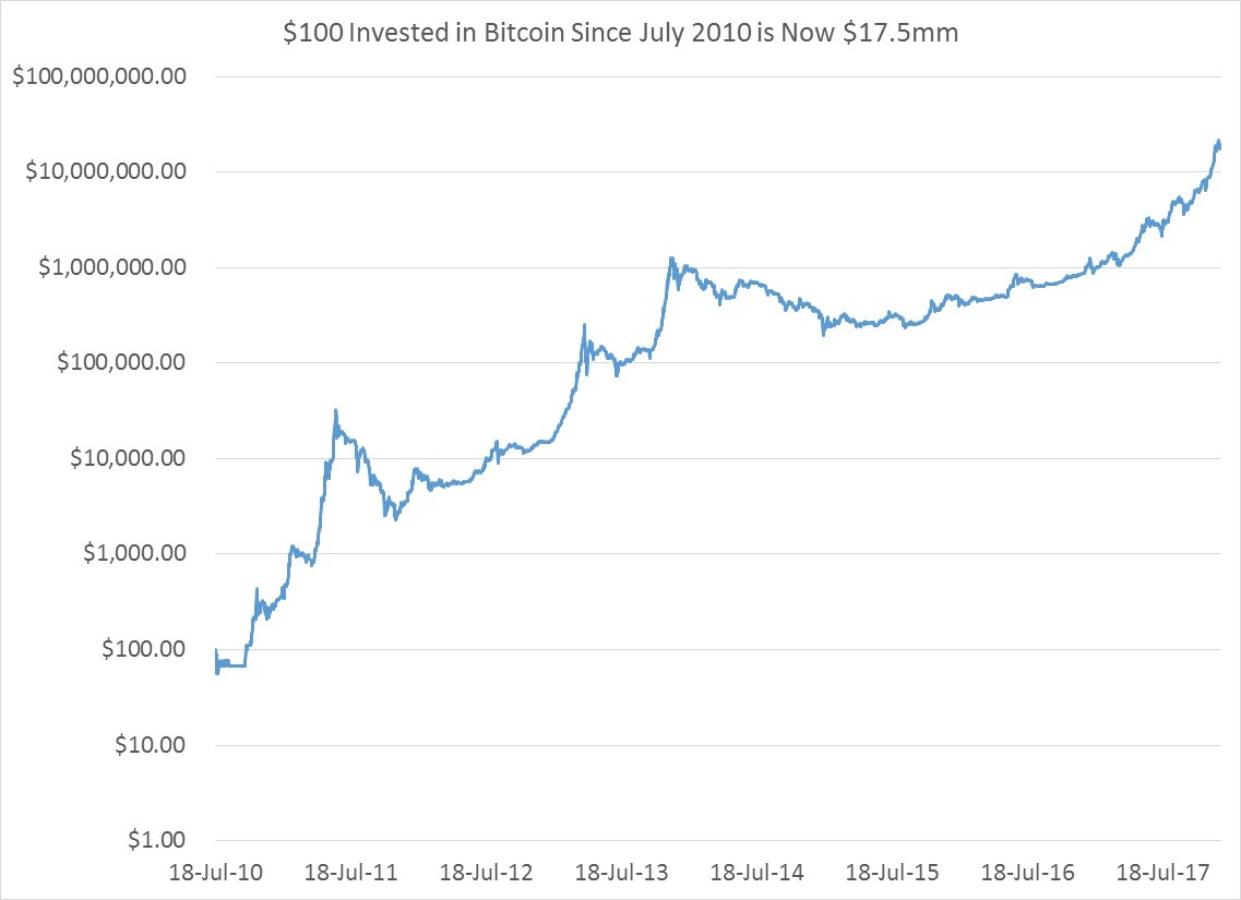
One thing Bitcoin does do consistently is trend, so an investor may consider a tactical timing strategy built around some such rules. The rules applied below were as follows: buy bitcoin if it has been up over the last 250 days, and for the first year when 250 days were not available, buy it if Bitcoin is up over the last month, otherwise don’t hold bitcoin. This turns out to have worked a lot better than buy and hold strategy, since your $100 would be worth $31 million dollars instead of a paltry $17.5 million.

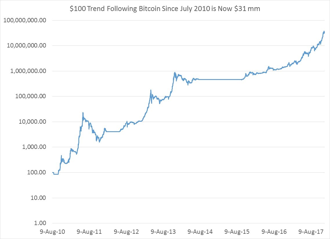
And the ride on the downside, while less horrific than a buy and hold strategy, was still rather violent and scary since you still lose 90% of your money at one point.

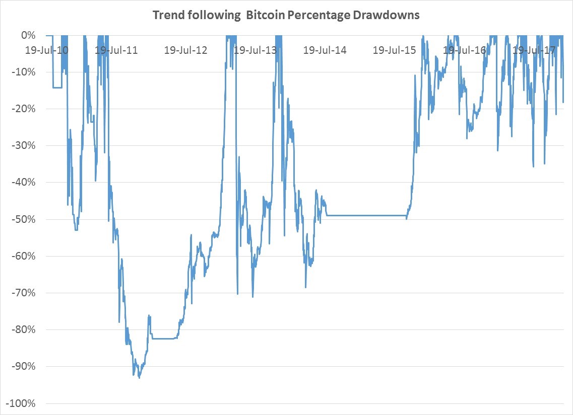
Whether Bitcoin will continue to soar and offer buy and hold investor or trend followers the same spectacular returns is unknown. What seems certain is the volatility of 79% annualized will probably be the norm for awhile.

The Odd Weekday Seasonality of SPY: Avoid Thursdays and Fridays

There is an old investing adage: “Sell in May and go away,” perhaps created by those who kept their yachts in Newport and wished to summer care free from the vagaries that the stock market brought from June until October.  While I lack the poetic wherewithal to create an adage that rhymes and is catchy, there has been a similar kind of under-performance factor in the ETF SPY since since its inception in 1993.  Thursday and Friday have offered the investor weak and sub-par returns relative to Monday through Wednesday.  Most long only equity traders would be better heading to the beach, gym or golf course on Thursdays in particular.

Below is a cumulative natural log chart of the ETF SPY since its inception in 1993.  Two bear markets and one long bull market recently.

The next chart shows the cumulative ln returns of holding SPY close to close on all five weekdays. That chart by itself doesn’t tell you that much other than that trading any one weekday is a bit noisy.

Its when you group days together that the story gets interesting.  Below you can see how much of SPY’s positive return through time has come from the first three days of the week on a percentage contribution basis.  The way to read this chart is simple:  if the SPY gained 100% cumulatively over a 15 year period a reading of 95% would indicate that 95% of the total 100% cumulative return came from M-W and only 5% from Thurs and Friday.  As you can see, over the past few years 83-84% of the cumulative returns for SPY since 1993 has come from Monday, Tuesday and Wednesday.  At times, because other weekdays like Thursday and Friday were net detractors from cumulative returns, their contribution actually has exceeded 100%, especially during the financial crisis.

Finally, if you believe in day of the week seasonality, you should close up shop Wednesday night go away on Thursday.  As you can see in the final chart, Thursdays detracted massively from SPY’s cumulative returns during the last 2 bear markets.  Historically only 7% of SPY’s cumulative positive returns since 1993 have come from Thursdays.


Volatility Targeting An Equity Index

Volatility Targeting is a simple concept.  You set an annual volatility target for an asset, and adjust your exposure through time to meet that target.  If your annual vol target is 10% and your measure of the asset’s volatility is 20%, you would hold 50% (10 divided by 20) of the asset to achieve the 10% vol.  Mathematically, your vol target is the numerator and your denominator is the vol estimate.  Most people either use implied volatility or trailing historic volatility as their vol estimate.  The question arises: why bother?

Well this concept is to a large degree second nature in hedge fund portfolios where it is a necessity.  If you have equal conviction that 2 year Note futures and S&P 500 futures are going to rise, you want them to have an equal impact on your PL.  Buying equal dollar amounts of both is pretty dumb, because all the volatility in your portfolio will come from the equity future position.  You have to either bring up the vol of your 2 year Note position to equal your S&P future position, or dial your equity down.  Vol targeting enables greater diversification by allowing uncorrelated assets to have the same impact in a portfolio.  This is the core idea behind risk-parity portfolios which use multiple assets.

In the last 10-15 years, this concept has entered into mainstream portfolio management.  And with good reason.   It works, though its popularity or overuse are now its biggest danger.  In general, the version employed in Mutual Fund and ETF land is more constrained—hedge funds don’t have an issue leveraging up 2 year notes 20 times or more to be at the same vol as the S&P 500.  Long only mutual fund managers are wary of levering anything more than 150%.  There are more regulations and leverage is “bad optics,” as I once heard someone say.  It is also within mainstream portfolio management that the idea has been applied more consistently to a single asset class, mostly equities, to be a tactical allocation decision device:  putting more money into equities when equity vol is low, and less when vol is high.

Using the SPY ETF, shows the performance enhancements and side effects that come from the vol target pharmacy when applied to a single asset.

For our exercise we will examine the performance of two portfolios, the ETF SPY and our volatility target enhanced version of the same.  Our volatility target is 1% daily vol or 15.8% annualized.  Our vol estimate will use the trailing standard deviation of SPY over the last 200 days as the denominator.  We can have a maximum position or leverage cap of 150% invested.  We will rebalance every Monday at the close.

Below is the PL from both portfolios.  Over time both portfolios do well, but the volatility target version offers better total returns.


Here are the performance stats.   When you look at risk-adjusted returns, the vol target portfolio is superior when you consider either the ratio of return to volatility or max loss.

 SPYSPY Vol
Tgt
Annual % Return10.8%12.1%
Annual Vol19%16%
Info Ratio0.580.74
Max % Drawdown-55%-39%

The vol target version of SPY experienced less painful maximum losses during the bear markets of 2003 and 2008.

The last chart, and perhaps the most interesting, shows the relative out performance of the vol target strategy vs. SPY alone through time.  What is apparent is that while it works, there are times when the vol target version of SPY really under-performs.   Vol target SPY has been brilliant from 2012 to present as volatility has just gone to sleep and you are levering up in a bull market.  The strategy also performed as designed going into the 2008 crisis, cutting risk as equities tanked.  But consider the equity bubble in 1998 and 1999 when stock returns were incredible, but vol itself was very high and you dialed back your equity exposure.  In this period you would have been much better off just buying SPY.  The post 2008 crisis period was also terrible.  Your trailing vol estimate combined with higher vol in general even in the implied vol market kept you dialed back in equities at a time that it would have been much better to just buy, and hold on for the ride.  In a high vol, high return environs, vol targeting can look pretty bad.


An Intraday Oddity in VIX Futures

One of the odder facets of capital markets in the last few years has been the shockingly low level of volatility, both realized and implied, especially in equity markets. Coincident with this decline in the level of volatility has been the emergence of two parallel developments.

Huge swathes of money, especially in equities, are now allocated completely mechanically on the basis of level of the VIX or historical realized volatility, whether in guaranteed annuities or risk parity portfolios. As a tactical strategy, this backtests well: if you cut your equity risk when vol rises, and vice-versa, you end up with decent returns, especially around crises. The problem is that everyone knows this now, and it’s a crowded trade. At some point in the future, some large and unexpected spike in volatility will cause these portfolios to liquidate equities en masse in a “portfolio insurance” herding a la the 1987 crash.  And then someone will scapegoat the quants who developed and used these asset allocation models.

Second, volatility has now emerged as an asset class in its own right, with liquid securities from ETFs to VIX futures offering traders a path to express their view on the future direction of vol itself.  Whether or not implied volatility in equities should be viewed as an asset class in itself is pretty dubious, given its high negative correlation to equities: if you are long stocks and short vol, you have increased the risk in your portfolio. Nevertheless, this is a radical change from even fifiteen years ago when someone who wanted to express a view on US equity vol had to buy or sell a straddle or strangle and every day manage the delta of her position. By comparison, it’s a cleaner, cheaper and simpler world today if you are a vol trader: just buy or sell a VIX future…done.

Shown below is the VIX Index since Dec 2016. Vol has moved downward in a random scary pattern from 14 to 10. Being short vol for this whole time was a successful, albeit painful & noisy trade.

To be clear, you can’t trade the VIX itself, only ETFs derived from it or VIX futures, which are probably the cheapest way to get equity vol exposure. The VIX futures curve is “typically” upward sloping as you move out the curve with contracts farther from expiry trading at higher prices. Over time this means that there is a roll-down effect from the natural term-structure: a contract that starts off at a price of say 15 three months from expiry will “roll down” closer to 12 as it approaches expiration, and the contract trading closest to expiry will converge downward towards the cash VIX Index itself.  So there is a natural tendency for VIX contracts to fall or lose value over time in a stable or normal market environment.  The VIX futures curve can invert and do lots of contortions in a market crisis, but that is another blog post.

Let’s say you were looking for a more consistent way to trade both the decline in the VIX over the last year and capture the tendency of VIX futures to decline over time. You could simply buy farther dated VIX futures and hold them until expiry, but this would give you a pretty bumpy ride.

Maybe you were looking for a more consistent and less risky way to make money being short vol over this time?  So you investigated day trading VIX futures.  If you were observant you would have noticed the following.

If you shorted the first VIX future every day from 8:30 am to 8:30 PM, ignoring transaction costs, you would do OK PL-wise, but its still a noisy path.

And if you did the complete opposite, and decided to short the first VIX future every night at 8:30 PM and cover your short at 8:30 am before the chaos of US economic announcements hits your position, again ignoring transaction costs. Well that works much better.

Why is this occurring? I don’t know, some of it is attributable to a bull market, but its strikingly persistent and weird pattern/anomaly. And it really doesn’t make much sense that the decline in Vol would happen in such a consistent part of the day, but there it is. The contrast between the random noise of the intraday vol down move vs the overnight decline is quite stunning. How long it will continue is anyone’s guess.

RSS
kent969@yahoo.com
LinkedIn
Share