When a currency rises, what happens economically and financially?

Since the end of January, the US Dollar, on a trade-weighted basis, has risen 5.4%.  Historically, when you look from 1975 onward, that is a lot.  Percentile-wise that puts the current move in the top 16% of all moves since 1975.  And when you consider upside standard deviation alone, its about a 1.82 Z move, meaning it’s a pretty rare, though not entirely an outlier, event.

So what happens economically and financially when your currency goes up a lot?  If you are an island economy or very export dependent like Japan, a large upside move in your currency should be painful, because it makes your exports uncompetitive and increases your import costs.  Or………so the conventional wisdom goes.

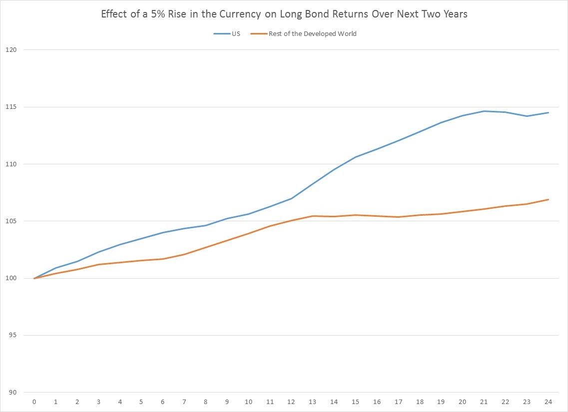
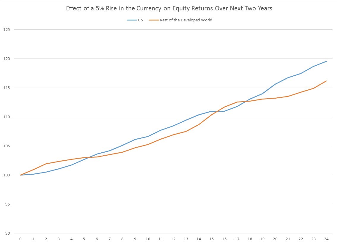
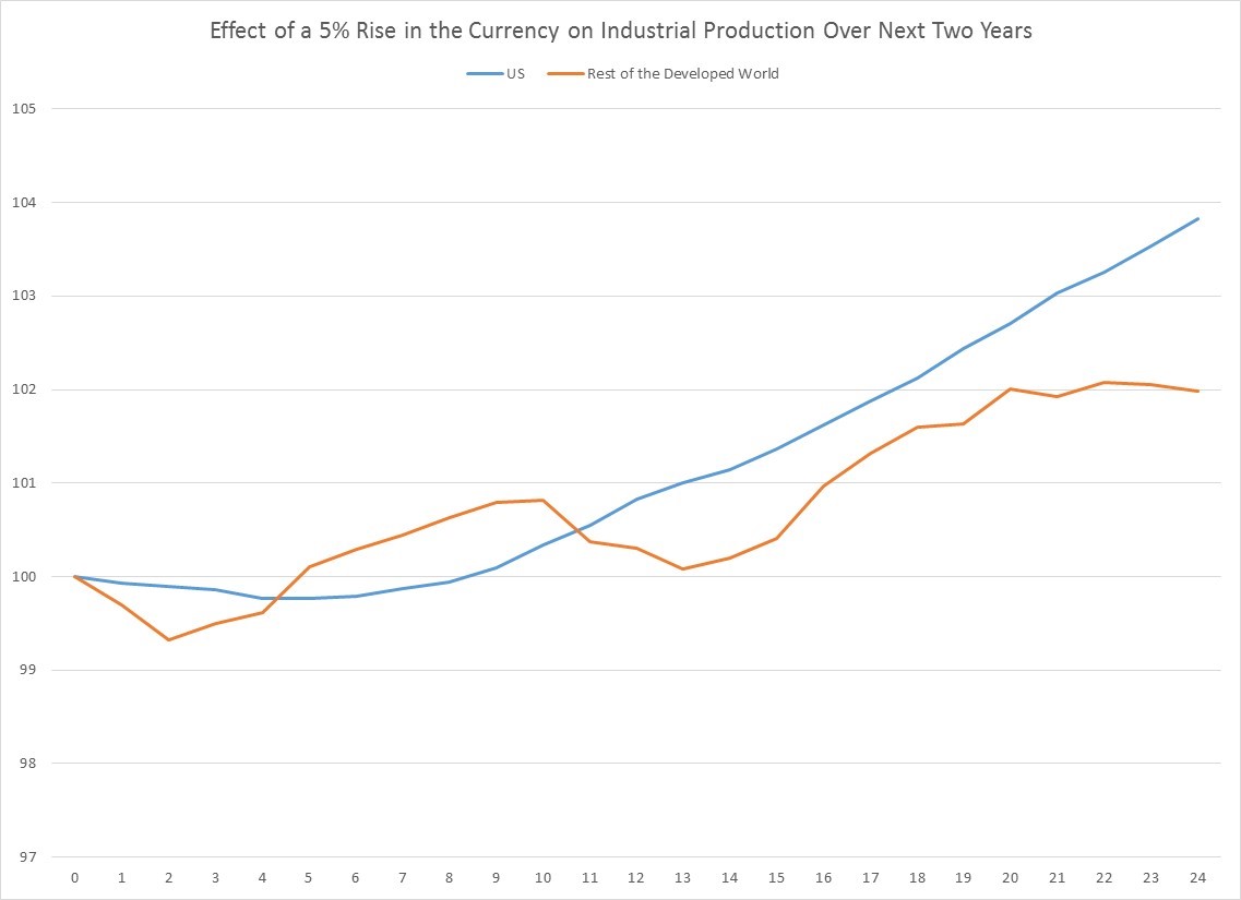
When you look at what actually happens to domestic markets in the developed world historically, as well as what happens to industrial production when the trade-weighted currency of an economy rises 5% or more, you find two things.  First, a big jump in the currency really doesn’t impact major financial markets at all.  Stocks and bonds rise normal amounts, perhaps because the FX move is seen as a temporary effect.  By contrast, a rise in the currency does appear to actually dampen industrial production, which is what one would expect.  Put another way, large currency moves in the developed world appear to have important economic consequences, but little impact on financial markets, perhaps because the economic impact is so short-lived.

Here is what happens to industrial production in the US and among 17 other developed countries after the trade-weighted currency rises 5% or more, using data from 1975 onward.  Historically there are 87 months when the US currency was up more than 5% over a 5 month stretch, and 769 months for the other 17 developed currencies.  As you can see in the chart, US and other developed markets both experience a period of about 5 months where industrial production growth contracts, on average, modestly.


By contrast, US and other developed fixed income and equity markets are pretty much unfazed by large currency appreciations, as you can see in the next two charts.

First Bonds.

Now stocks.

Obviously a few countries are exceptional.  Australia, Norway and Hong Kong do see equity declines for several months after a large swing upward in the currency, but with the exception of Norway, every equity market is higher a year later after a currency jump.

So the next time someone tells you the large rise in the currency of a developed nation is going to make them uncompetitive and cause their markets to fall, you should probably ignore them, and go have a coffee.


Please follow and like us:

Summer doldrums

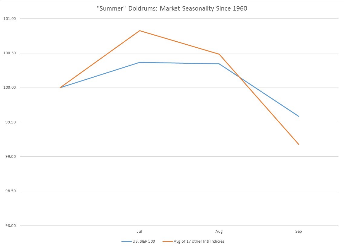
Apologies for the long delay, been travelling and settling in overseas.  But without further ado, let’s take a quick look at what the summer months ahead have historically brought to us in equities both domestically and abroad, when you look at history over the last 50+ years.  Since June is creeping to a close, and summer officially has only just started we will call the monthly returns of July, Aug and Sept “summer”, especially since these are the next 3 months on investors’ calendars and minds.

Looking at monthly data, the next 3 months have been pretty unimpressive from a return perspective whether you park your money at home or abroad, as you can see in the chart below.  Investing in the US over the next 3 months has historically resulted in a loss of 42 bps, most of which comes in Sept.  Similarly if you go abroad, like I have, and invest there, like I won’t, over the next 3 months, you returns are worse—an 82 bps loss.

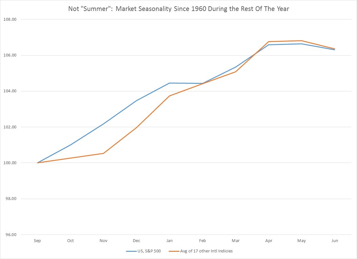
By contrast, these are your returns for the rest of the calendar year.   Whether you invest your money in the US or abroad you have historically made about 6.3%, as you can see below.

So what’s this lesson in all this?  If you believe in seasonality, then don’t worry about the market in the US or abroad, and come back and invest Sept 30th.  Go on vacation, enjoy yourself.


Please follow and like us:

Leveraged ETFs-Friend or Foe?

This was also published in https://www.etftrends.com/etf-strategist-channel/leveraged-etfs-friend-or-foe/ in conjunction with Chris Shuba of Helios Quantitative Research


Every time I pull up a leveraged ETF or ETN for review I get the same sensation as walking into a Vegas casino. If I happen to throw down a bet at just the right time I can make a fortune, but if I don’t, it’s curtains.

Leveraged ETFs, and ETNs, which presently come in two flavors–either 2x or 3x, are very useful short-term trading instruments if an investor is extremely confident that a particular asset or industry is going to go up or down over a fairly short time period. For most people, and I mean MOST, levered ETFs and ETNs are best used as a trading vehicle.

Whether leveraged ETFs belong in a portfolio as a long-term investment depends upon the risk appetite, age or time-horizon of the investor. In my opinion, they make no sense as an investment vehicle for older individuals or those already in retirement unless they like the casino more than I do.

To start, we need to provide clarification on the technical differences between ETFs (Exchange Traded Funds) and ETNs (Exchange Traded Notes). Both trade on an exchange and track the performance of an asset, often an index. However, whereas an ETF holds underlying assets, an ETN or exchange is a Note with a credit rating and counterparty risk. An ETN has pluses related to lower long-term capital gains and less tracking error since it is not buying and selling underlying assets. For this article, we will almost always be using the term ETF to include ETNs.

First, let’s talk about the obvious risks of levered exchange-traded products.

Risk of Ruin
For longer-term investing, leveraged ETFs have a high risk of ruin for the investor. The math is simple. If a 2x levered ETF has a one day move down of -50% or more, the ETF is basically worthless. All your money is gone. For a 3x ETF that bankruptcy number is a daily down move of only -33.33%. In pragmatic terms that means you are taking on massive risk to invest long-term in narrowly focused ETFs that contain a small number of stocks (e.g., 30 stocks or less), or ETFs that are highly volatile. The odds of you going broke are high, and I mean REALLY high! Levered strategies that focus on diversified indexes like the S&P 500 present a slightly lower risk of ruin.

Large Drawdowns
Even without the risk of ruin, and even using a more diversified index like the S&P 500, the drawdowns in capital a long-term investor can expect are staggering. A hypothetical 3x daily investment in the S&P 500 since 1950 would see an investor experience two losses of over 80%. And in 2009, you would have lost 97.5% of your money. Are you ready to see a $10,000 investment reduced to $250 at some point?

Long Drawdowns
If you had invested in a hypothetical 3x daily S&P 500 ETF in March 2000, you would still be down over -22% on your initial investment. After 18 years you still have not made any money and remain in the red. That’s a long time and a lot of lost purchasing power. So it probably does not make sense to get into a levered ETF when the market is close to new highs. With levered ETFs, timing is everything.

Sideways Bleed
If markets are choppy and go sideways, your investment will decline, whether you choose the bear or the bull ETF, because of the convex nature of daily levered ETF returns. In choppy markets, both bear and bull ETFs can lose money.

Fees
The annual fees for levered ETFs can be considerable, typically around 1%

Liquidity and Replication Risk
Most leveraged ETFs are implemented via swaps and a variety of other derivative instruments which rebalance on a daily basis. These are derivatives, not underlying securities, so there is no guarantee that the NAV will track the ETF’s target index. Tracking the target index is less of a problem for large liquid indexes like the S&P 500 than it is for more narrowly focused ETFs. In the next financial crisis, the over-the-counter derivatives that underlie the 3x ETF in a small Latin American country or a narrowly specialized stock sector will cease to exist. There will be no liquidity because no one will make OTC markets for them.

Default Risk
Levered ETN issuers may default on the Note they have issued to investors.

Now that we understand some of the considerable risks of levered ETFs, what are the potential rewards?

Levered ETFs have one extremely attractive investment feature: optionality. Your loss is capped at your initial investment, but your upside is potentially unlimited.

The problem is that there are more paths to losing money than capturing this upside. Put another way, the probability of you winning big is very small… just like in Vegas.

To make money in a levered ETF you have to be right, and have extreme patience or impeccable timing.

Let’s look at being right. The early 80s were a good time to lever up bonds – but we are no longer in the early 1980s. Rates are historically very low, and the probability of a long bull market in fixed income is now not good.  Since equities have historically gone up over long stretches of time, it probably makes the most sense to invest levered in equities, especially a broad index like the S&P 500 where your risk of one day ruin is smaller.

Since it’s hard to have impeccable timing, the best you can do is invest ONLY after there has been a decent correction, though even this is no guarantee of profitability. If you invested in a 3x levered S&P 500 ETF in 2002, you were still down a decade later, because of the 2008 crash. But, getting in when stocks are close to new highs has been an even less profitable way to invest in levered equity ETFs.

Which leaves patience. The average 10 year return for a hypothetical 3x levered S&P 500 ETF since 1950 has been 582%. Nice. This return comes with the caveat that most of this average is skewed by the outlier returns you would have experienced in the late 1990s. There were also 10 year periods where you lost over -96% of your investment. Ouch.

It’s only when you move to a 20-year time horizon that historically our hypothetical 3x levered S&P 500 ETF has provided positive expected returns, irrespective of when you invested. At 20 years, which is a long time, your worst 20-year return was +15%. Contrast this with an unlevered investment in the S&P 500 where your worst 20-year return was +53.8%. In a contrast of worst case scenarios, the unlevered version wins.

Now consider median results. Your median return was 699% levered vs. 274% unlevered. So it seems like the levered version is better. But, again all of this was skewed by the 50,000+% return from the 1980s and 90s bull market. That’s one event severely skewing the average. And that event was driven by a huge decline in interest rates from very high levels. If interest rates get high enough again, a 20-year levered bet on equities might make sense, but until then, probably not.

I know what you’re thinking. 50,000+%?!?!  Like I said, every time I pull up a levered ETF or ETN to review I get the same sensation as walking into a Vegas casino…

Please follow and like us:
Do Stocks Perform Better When Consumption Growth is Booming or in the Doldrums?

Consumption growth matters a great deal in the developed world.  It’s about 2/3rd of US GDP.  So you would think there would be a pretty clear linkage between higher consumer growth rates, faster earnings growth and superior stock performance.   Think again.

In fact, it’s quite the opposite.

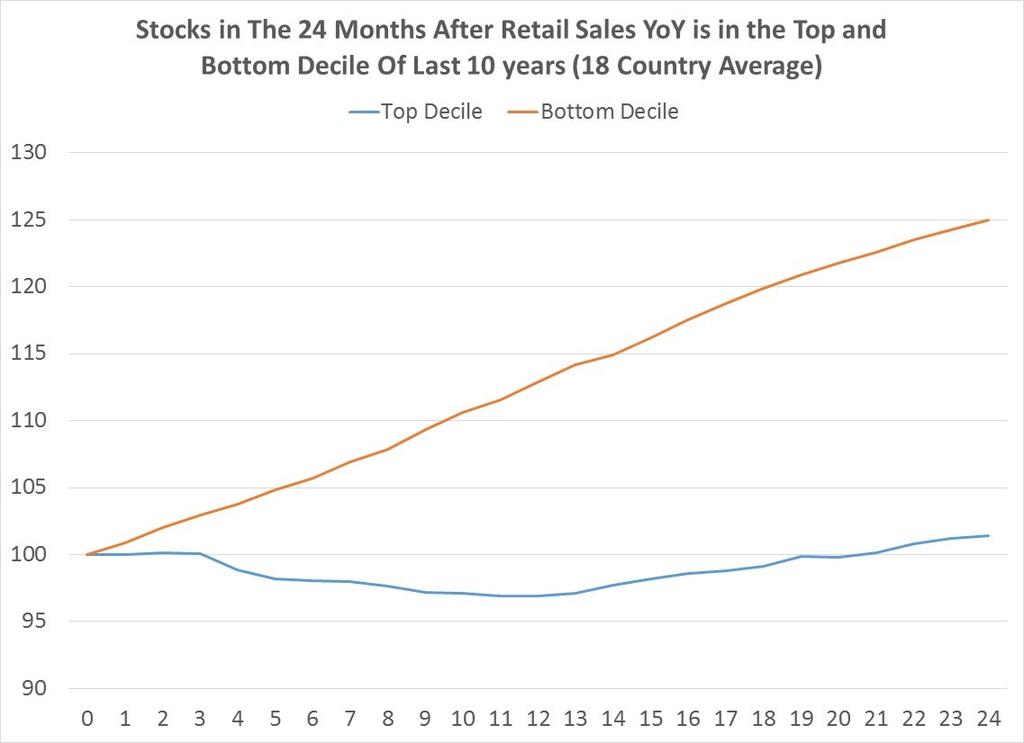
When you look at periods when annual retail sales growth was in the top decile and bottom decile over the last 10 years, and then measure subsequent stock returns, the bottom decile wins quite handily.  The chart below shows an 18 developed country average since 1960 of stock index returns after annual retail sales growth was in the bottom or top decile over the prior decade.

We have some sample size here too.  Between the 18 countries, there were 570 months when annual retail sales was in the top decile and 856 months when it was in the bottom decile.  To prevent one country dominating, I simply took an equal average across all countries.

What the chart shows is not a subtle difference.  When retail sales growth is in the bottom decile, you make, on average, just short of 25% over the next 2 years.  Buy when its in the top decile, and you make a mere 1.43% over the next 24 months.


Why?

I don’t know but there are two probable explanations, both of which may be at play.  Weaker growth leads to lower interest rates which begets borrowing and expansion.  Higher growth leads to higher rates and things slow down.  Markets are also discounting mechanisms and people aren’t real good at imagining a world different than the world they currently inhabit.  So when consumption is weak, people and markets are overly pessimistic.  Similarly, “happy days are here again” consumption is probably the period the market has become overly optimistic in its future pricing.

At present, only one country, France, sits in the top decile of 10 year retail sales growth.  No one, unsurprisingly, is currently in the bottom decile.

Please follow and like us:
What Happens Economically and Financially When The Short-end of the Yield Curve Inverts?

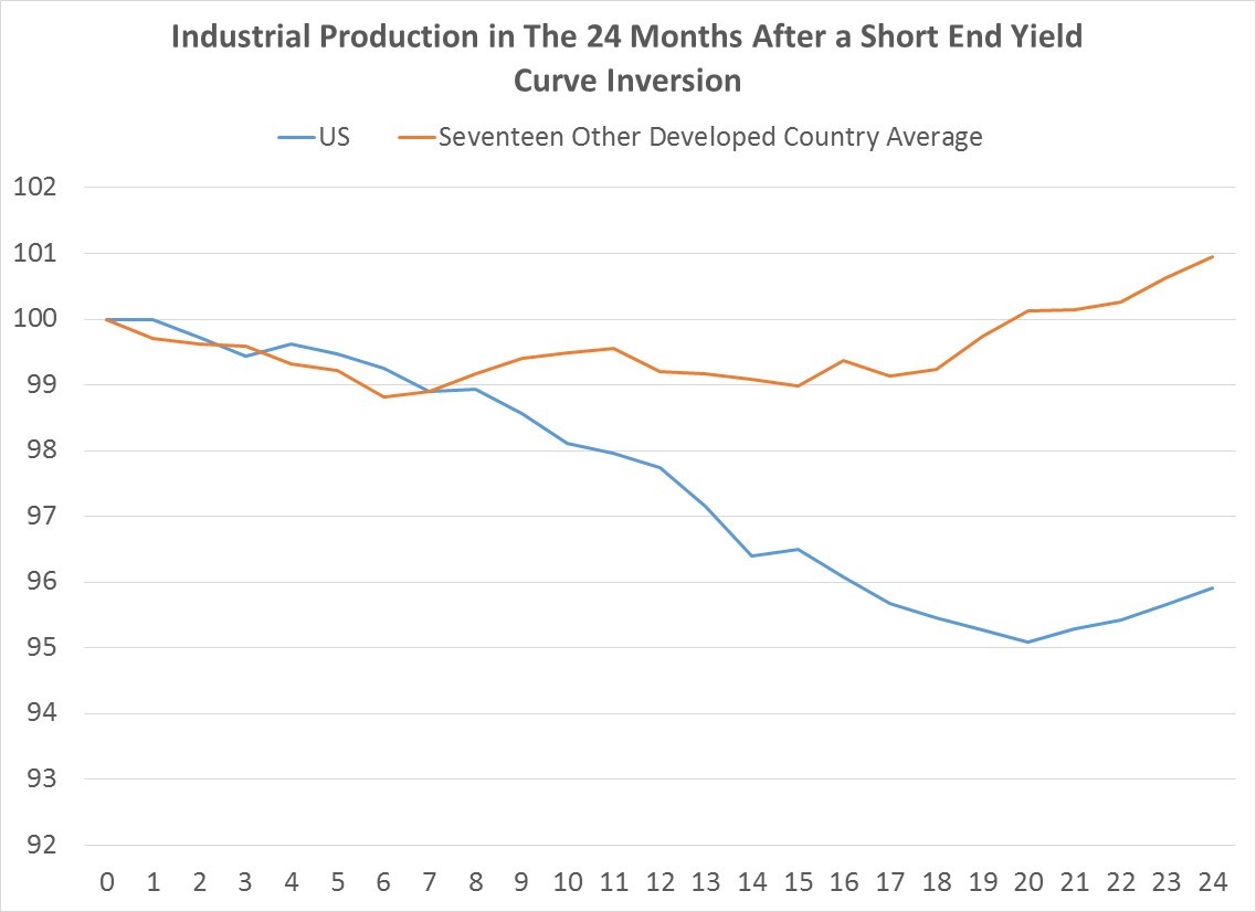
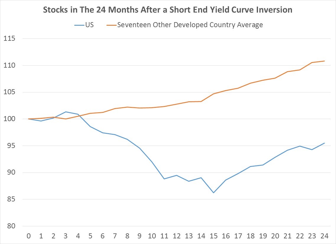
There are multiple ways of measuring the yield curve, but for the purposes of this post, we will be focusing on the short-end only, meaning the difference between the 2-year note yield and 3 month T-Bill rate.  In a normal market, interest rates at two years trade above those at 3 months, because there is greater risk in lending for a longer period of time.  Occasionally, however, short rates rise above long rates.  In the US, this inversion has happened 15 times since 1960.  In a fuller global set of developed markets that excludes the US, this inversion has happened 409 times since 1960. Yield curve inversion is traditionally seen as a negative, either a sign that banks will refuse to lend at rates below deposit rates, or that monetary policy is too tight.  What we see when we look at the data is that while inversion of the short-end of the yield curve is bad economically across almost all countries, and also bad for US financial markets, the results for financial markets outside the US are actually (and surprisingly) positive.

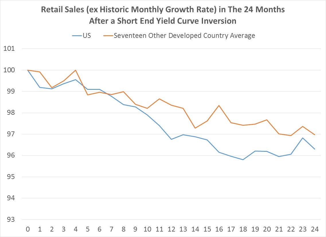
To measure economic impact, we will look at two simple metrics: industrial production and retail sales growth.  In each chart you will see what has happened in the two years following each yield curve inversion, on average.

The first chart shows what has happened to industrial production both in the US and the rest of the developed world over the last six decades after 3-month rates rise above 2-year yields (having been below the prior month).  In the US, the results are bad for the next two years (with growth only beginning to come out of its decline after 21 months).  We see a pretty similar story outside the United States, though because this is a much larger average of countries and outcomes, the results are more muted.  After a yield curve inversion, most developed countries’ industrial production declines about 1% and remains depressed for about 18 month before beginning to rise again.  There are a few exceptions, notably the English speaking countries.  Australia, Canada, New Zealand, the UK and Singapore show little to no decline in industrial production.

(Data Sources: Federal Reserve, US Census Bureau, as well as other Central Bank, Ministries of Finance & National Statistical Offices for non-US countries)

The next chart shows what happens to retail sales.  Unlike industrial production, which can frequently actually contract, retail sales almost always grow, so to adjust for this, the chart shows how much retail sales are weaker than the long-term growth rate in each country.   Whether it’s in the US or the rest of the developed world, yield curve inversion at the short end of the curve leads to below trend consumer spending.   Only one country is an exception to this: Italy.  Don’t ask, I don’t know why.

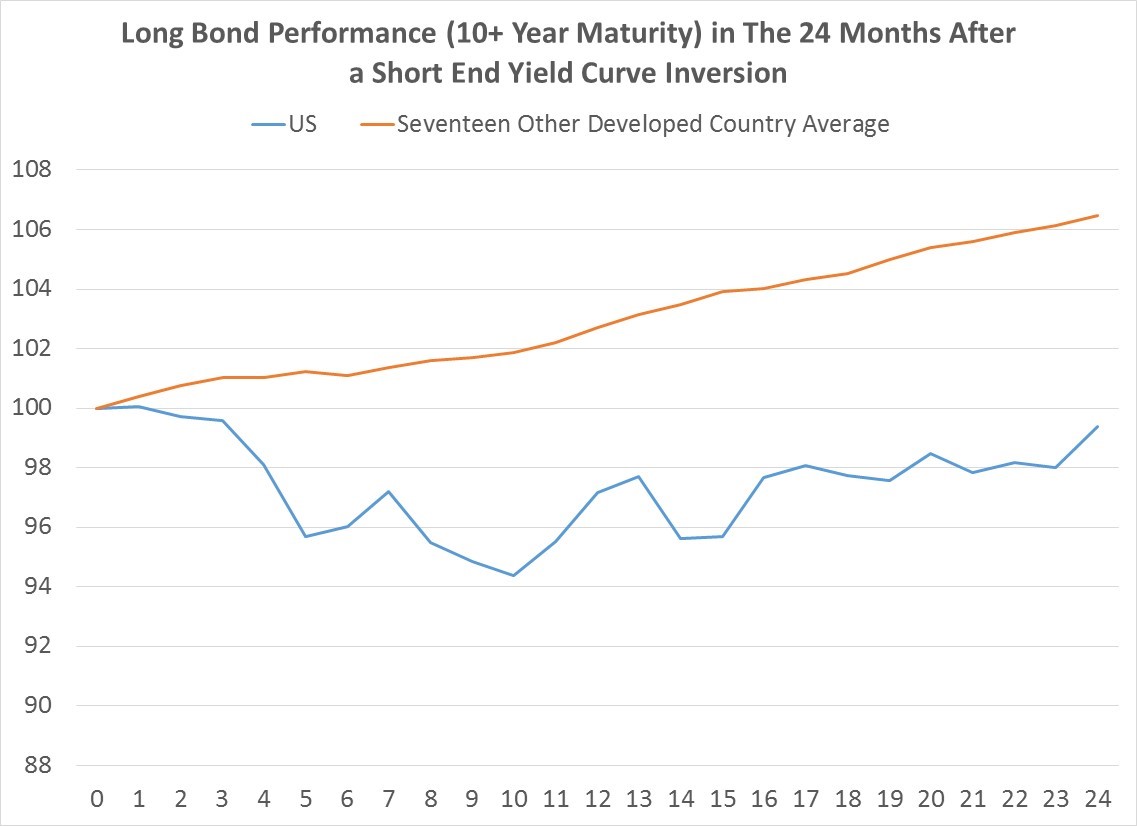
With all that horrible economic news a yield curve inversion should be bullish for longer maturity (10+ year) bonds, since there is almost no inflation threat on the horizon.  Turns out that this logic does indeed hold, except in the US.  As you can see in the next chart, in the first 9-10 months after the US yield curve flips, longer bonds actually decline.  By contrast, in the rest of the developed world, inversion is universally positive for bond prices.  After one year, every non-US developed country’s average bond market is higher than when the inversion happened.

Finally, let’s consider the impact on stocks.  Looking at the last chart, one can see that yield curve inversion is pretty terrible for US equities, which decline, on average, about 14%.  By contrast and somewhat surprisingly, most other developed countries actually experience stock appreciation after an inversion, though there is some variation, unlike in bonds.  After one year, Italy, Hong Kong, the Netherlands, Denmark all show lower stock prices, but after 24 months all markets, except the US were higher on average.

To tie up, yield curve inversion at the short end of the curve is almost always followed by economic weakness.  Whether it is a driver or simply coincidental is a question I cannot answer.  What is clear is that economic contraction following an inversion is a pretty universal phenomenon in developed countries.

What the inversion means for financial markets shows a bit more variation.  In the US, the results are bad whether you are in stocks or bonds, though it’s a lot worse in stocks.  Other developed countries universally experience bond rallies, probably as a result of weak economic news.  In general, global developed stocks also rally eventually following an inversion as well, perhaps because their longer term rates are moving lower.  Put another way, the decline in US stocks and bonds following a yield curve inversion at the short end of the term structure appears to make the US the exception to the more universal rule.

Please follow and like us:
What have 1% annual gains in interest rates meant for long bonds?

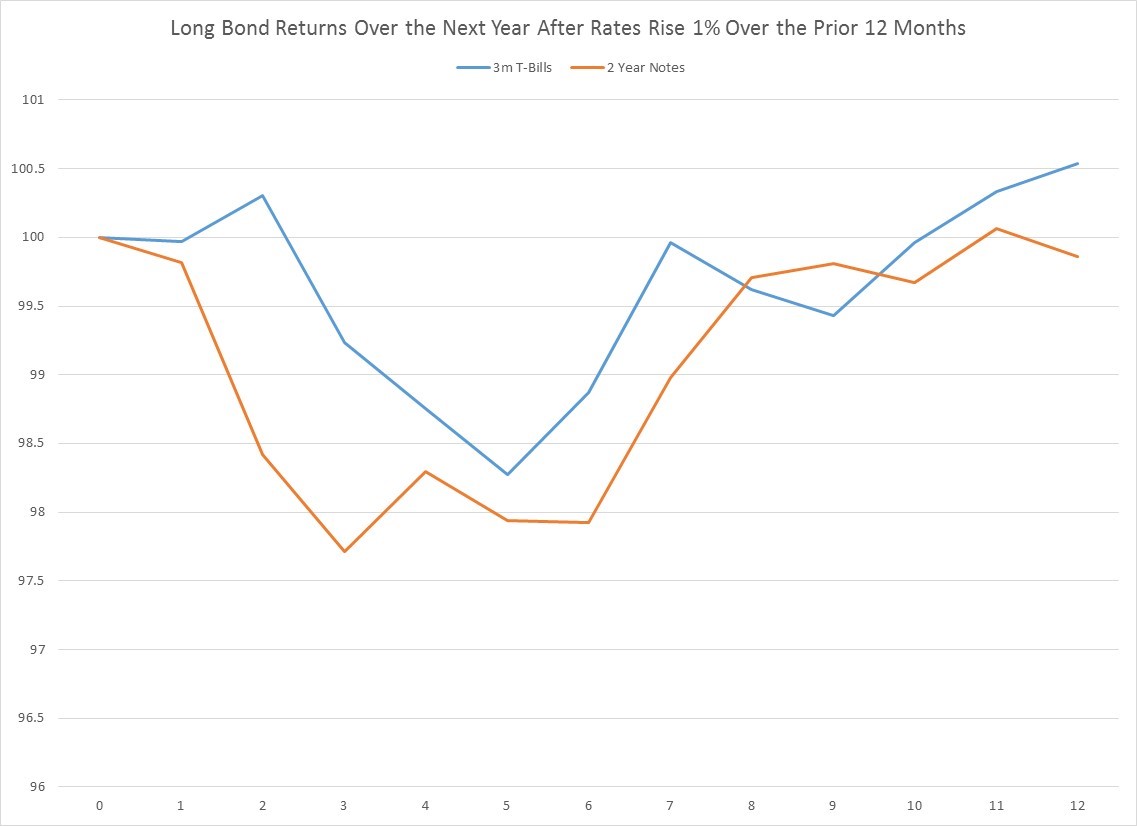
Last week we looked back through US and several developed countries financial history to see what effect of a 1% annual gain in short term interest rates had upon subsequent equity returns. The results showed that US equities have a fairly negative outlook over the next 4-6 months from an interest rate history perspective. This week we are going to be applying the same test to see the effect on long bond returns. Unfortunately, the news is also bearish for expected long bond returns for the next 4-6 months.

As noted last week, 3-month T-Bills have experienced annual changes of 1% or greater 21 times since 1960, while 2-year notes have seen 28 such increases. The first chart below shows what has happened to US long bond returns (meaning Treasuries of around 20 year maturities) over the next year. Like stocks, negative returns seem to bottom around 4-6 months out, with losses of 1.5% to 2% being highly probable if the past is any guide. Though 1 year later, the pain is over and you are back to flat. Whether US bond investors should expect this bond bounce back to repeat itself this time remains a question mark for me, however. Keep in mind that interest rates and bond yields have been in secular decline since their peak in the early 1980s, and there are a lot of tells of future inflation looming on the horizon at present.

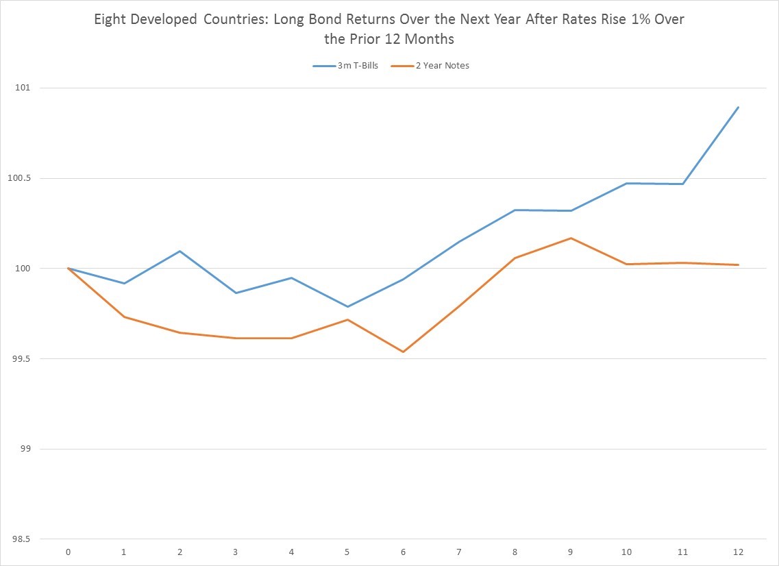
Extending the same analysis more globally to 8 developing major countries, we can see a similar pattern, though with more sample size. Internationally, 3-month T-Bills have shown annual changes of 1% or greater 114 times since 1960, while 2-year notes have experienced 121 increases. Like in the US, the long bond’s maximum losses happen about 5-6 months out, but it’s worth pointing out that the loss is a much more modest 25-50 basis point decline. And also like the US, returns 1 year later are flat and even up.

We will conclude the same way we did last week, by pointing out that while the US and Canada have recently experienced 1% annual increases in short-term rates, the rest of developed world has not. So investing in other developing bond markets outside North America remains a very attractive relative value proposition for the next 4-6 months.

Please follow and like us:
What have 1% annual gains in interest rates meant for equities?

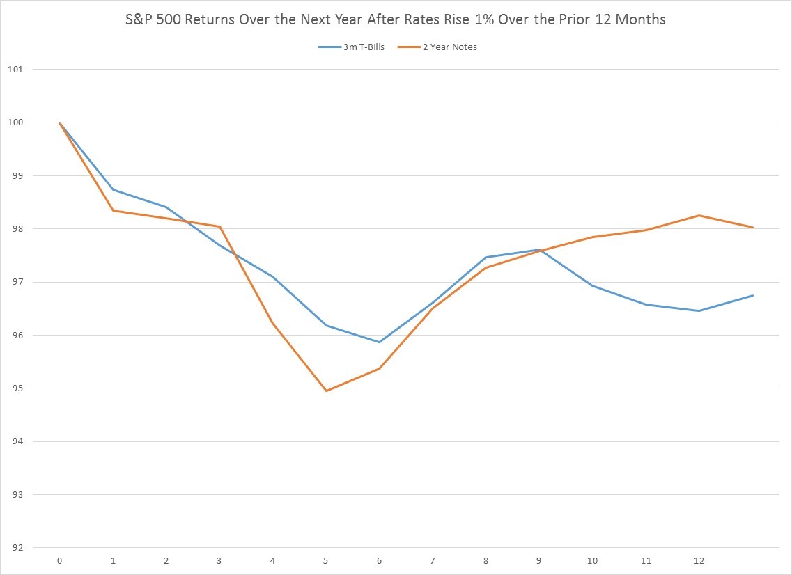
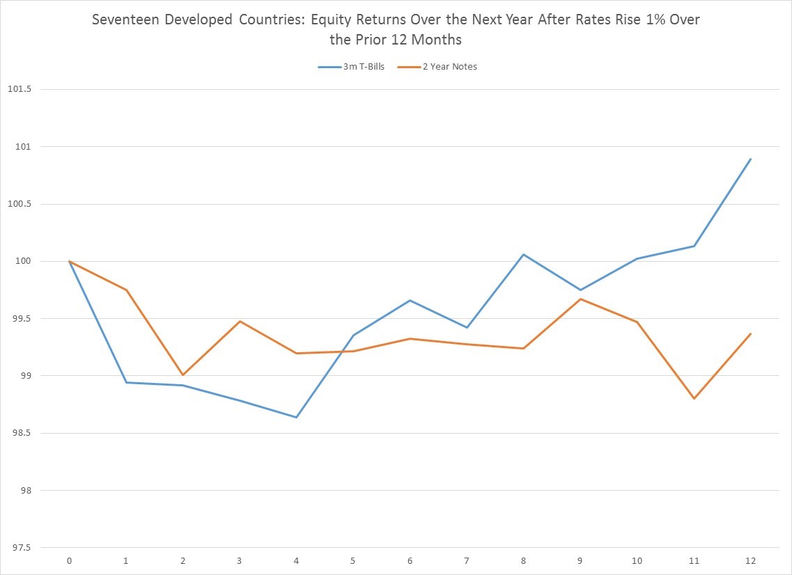
Over the last year, 3-month T-Bills and 2-year Notes have both gone from up about 100 basis points.  In theory, higher interest rates should not be good for stocks.  Higher rates curb economic demand and therefore sales growth and ultimately earnings growth, and simultaneously raise the cost of corporate borrowing which funds earnings.  And when you look both in the US and across a large swathe of developed countries, this relationship holds.  Put another way, the prospects for positive equity returns for the next 1-12 months in the US, if 1 year interest rate changes are your only guide, is negative.

Since 1960, annual changes in 3-month T Bills greater than 1% (with the annual change from the prior month being less than 1%) have occurred 21 times, using month-end data.  One year changes greater than 1% for 2-year notes have happened 28 times over the last six decades.  The first chart shows what equity returns look like, on average, in the next year after this rate increase.  Results over the next year are negative with most of that decline occurring in the first 5 months.  While this does not mean equities can’t go up in the US, it does mean that the statistical odds favor a decline.

When you look at a much larger set of developed countries, the same relationship holds, only the statistical evidence is that much stronger (as you can see in the next chart).  Over the last 6 decades, a +1% annual jump in rates has happened 258 times for 3 M bills, and 208 times for 2 year notes.  As in the US, most of the negative returns occur in the first few months.

If the recent 1% annual jump in US rates is negative for domestic stocks on an absolute basis, the same is not true in the rest of the developing world.  Only Canada, where annual changes in 2 year note recently passed above 1%, has seen rising rates on the same scale as the US. Outside North America no major developed economy is seeing rate hikes this quickly (some are actually declining), so there is a strong case selling North American equity in favor of other developed equity markets over the next few months.

Please follow and like us:
Something to Think About: On Chinese Trade Wars and Inflation

Ignoring the inflationary pressures that come from an immigration policy bent on constricting the supply of domestic labor in an already tight labor market, and the consequences of ballooning public sector spending on higher interest rates, and consider for a moment what trade means to the US economy.   Depending upon the year, imports range from about 13-17% of total US gross domestic product.  We import a lot of stuff from Asia and especially China, because it’s cheaper to make there.

We do this for a reason.  Trade is not a zero sum game, but a win-win for both parties, thanks to the economic concept of specialization.  You can make something, say iphones, better than me. And I, in turn, can make something better and cheaper than you, say soybeans. And we exchange one good for another to live richer lives.

Since July of 2008, imports from Asia have grown 30% and imports from China have grown 56%. Over that same period, US consumer prices have risen a mere 13.2%, which is pretty subdued. One of the contributing factors to keeping US inflation so low has been deflation in Asian import prices.  Since July of 2008, imports from Asia have risen 30%, while prices for these imports have FALLEN 36%. Let’s repeat that.  The value of all imports from Asia is up 30% while the prices of those imports is down 36%.  In other words, as US consumers of imports over the last ten years, we have gotten more and more services and goods and paid less and less for them.  A trade war with China, which represents about 47% of Asian imports, would completely reverse this trend, eroding US purchasing power, especially for goods, and put upward pressure on inflation and therefore interest rates.  So while tariffs on Chinese imports may just be a posturing gesture in the art of a deal, should those tariffs become reality, the economic and financial consequences could be fantastically ugly.

Please follow and like us:
Something Scary in Consumer Credit Growth


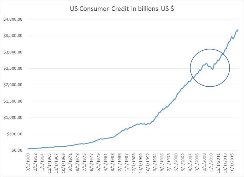
With the exception of a few anomalous periods, consumer credit has pretty much always grown (as you can see in the first chart below).  Not shockingly, it actually contracted briefly during the crisis of 2008, as households cut back.


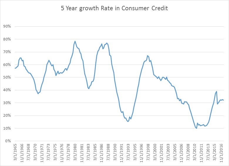
When you look at longer-term growth rates in consumer credit, things look fairly normal.  We are not near historic 5 year growth rate lows of 10%, like we were in the crisis, or even the 20% lows we saw in the early 1990s.  Consumer credit 5 year growth is hanging in there around 30%, which is historically a little on the low side, but not terribly so.

Dig a bit deeper beneath the surface, however, and you do see two interesting recent trends.

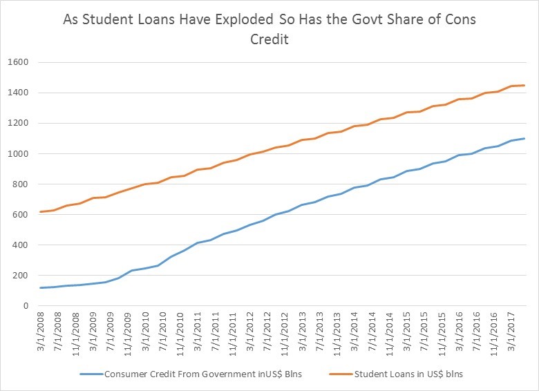
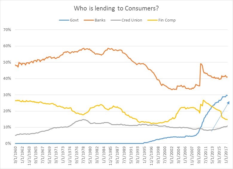
First, the government has become a major player in consumer credit markets, especially since the financial crisis when risk averse financial institutions became much stingier.  Below is a chart of the composition of who is lending to consumers by institution type.  Banks have always been, and continue to be, the largest providers of consumer credit.  Historically, they have provided 50-60% of consumer funds, though that has dipped closer to 40% since the mid 90s.  Financial companies and credit unions show some variability through time, with financial companies seeing a 10% decline in their share of the lending market since 2010.  But by far the largest change, and the one most worrying if you are a believer in free markets, is the huge jump in the presence of the government in providing credit:  the government is now close to 30% of the consumer credit market now vs. 5% ten years ago.  This is almost entirely a result a second secular trend in the credit markets—the explosion of student debt.

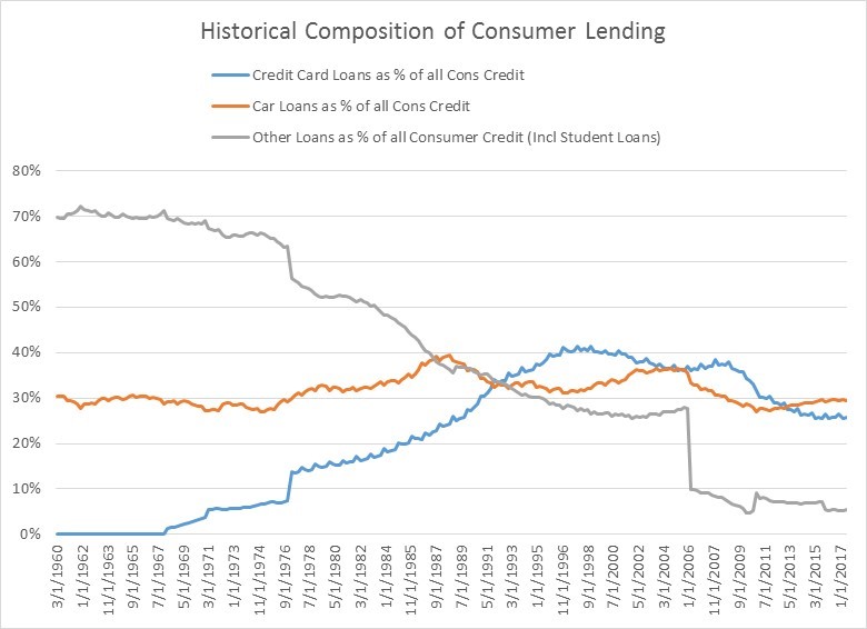
If you look at a longer-term historic chart that breaks down what types of consumer loans were taken, you don’t get a ton of insight because student loans have only been broken out by the Fed since 2006.

What’s interesting is how credit card debt was fairly non existent in the early 1970s at a mere 5% of consumer debt and ran up to 40% in the late 90% and has since come back down closer to 25%.  Car loans, by contrast, have been pretty steady at 30% of total consumer credit.

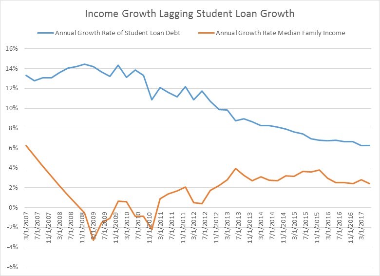
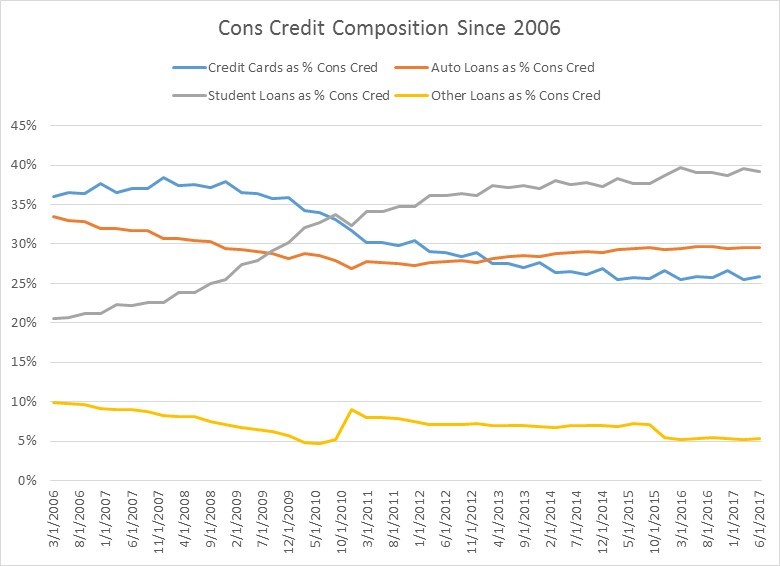
It’s only when you look at a breakdown of consumer credit since 2006 (when the student loan data becomes fully available) that the changes in US consumer debt composition become so obvious.  As you can see in grey line in the chart below, student loans have moved from 20% of all consumer credit in 2006 to close to 40% now to become the largest percentage of all consumer credit.

The government’s increasing market share of consumer credit is directly tied to the rapid growth in student loans.


The problem is that, in the long run, the growth rate in student loans is utterly unsustainable.  There is too large a gap between the higher growth rates in student loans and lower growth rates in household incomes.  As we learnt from the last crisis, there is only so long that debt growth can outrun income and asset growth.  If borrowing growth exceeds income growth, debt payments either cannot be made and we get defaults, assets have to be liquidated to fund debt payments (young people out of school however have no assets), or students will have to go to family to fund their debt.  None of this is good for consumption or the growth in earnings of companies are tied to younger consumers.

At some point either student loans growth will have to slow, or these loans will have to be written down.  This may or may not be a “credit bubble” since bubbles typically require some leverable asset that increases in value, but nomenclature aside, at some point there will be reckoning.


Please follow and like us:
Is it Better to Use Smart Beta When Investing Abroad?


A slightly different version of this post, written with Chris Shuba and Joe Mallen of Helios Quantitative appeared here: IRIS

You are a US investor that wants to deploy some of your money overseas.  You think international developed market stocks are attractive relative to US stocks, and you also think the US $ will decline over the period you intend to hold your investment.  Your investment decision is logical to you. But you have choices:  You could a) simply invest in a traditional index like the MSCI EAFE, b) invest in a fund that systematically emphasizes a particular factor like a value fund that only buys cheap overseas stocks, or c) invest in a developed fund that blends several factors together, like the JPMorgan Diversified Return International Equity ETF (JPIN).  What is the best choice?

Investing in a traditional international market capitalization index like the MSCI EAFE is not a bad choice. It has delivered nice returns for a US investor, especially uncorrelated outperformance in the 1970s and 1980s, and helped to diversify a US-only portfolio.

Your second choice is to invest in one particular investing style because it makes sense to you.  You might believe that a fund or index that chooses the cheapest or most attractively valued stocks based on metrics like Price to Earnings (PE) is best.

You could go find a discretionary portfolio manager who only buys stocks he deems to be cheap.  Typically the concept of “cheap” is based on some absolute metric that the manager has in mind, such as never buying a stock with a PE greater than 15.  If there are not enough stocks that are attractive, he will hold his money in cash until he finds the prudent bargains he seeks.  This prudence also obviously risks possible underperformance from being absent from the market.

The alternative is to buy a value index or fund that systematically only buys the cheapest stocks in a particular investment universe.  So if there are 1000 investable stocks available, the index ONLY buys the cheapest decile of 100 stocks and is always fully invested in the 100 securities that are relatively cheapest.  This is an investment approach that a discretionary manger may disdain.  The discretionary value manager may look at those same 100 stocks and think they are pricey.  But nevertheless, academic research has shown that always being fully invested in the relatively cheapest percentiles of stocks in the US has produced superior returns over many decades.

Such a portfolio is called a “factor” portfolio.  Why the name?   In the early 1960s, academics introduced the concept of beta and demonstrated that individual US stocks had sensitivities to, and were driven by, movements in the broad market.  In the early 1990s, academic research began to show that other “factors” such as value and size also drove US stock returns.  Since then, several factors have been identified as driving individual stock outperformance: value, size, volatility, momentum and quality.  Stocks that are cheaper, smaller, less volatile, have more positive annual returns and higher profitability have historically outperformed their peers.  It turns out these factors also work internationally.

Of all the factors, value is the factor that has been the best known the longest (even before it was academically identified as a “factor”), thanks to the books of Warren Buffet’s teacher Ben Graham.   And if you look abroad at an array of developed global markets and create a value index and compare it to its simple market capitalization weighted brother, the historic outperformance of value has been stunning.  Until recently.

While there was some variability by country, on average from the mid-1970s up until 2005 a value factor portfolio in a developed market outperformed its market cap weighted index by about 2% a year.  That’s a lot. By contrast, since 2005, the average developed country value portfolio has underperformed a market cap indexes by about -40 basis points.  Which is the danger of investing in one factor.  It may not always work at every point in time.

So if investing in one factor like value runs the risk of underperforming, how about a multi-factor international developed equity portfolio?

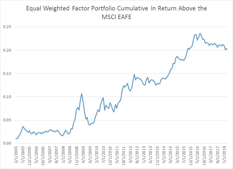
Below is a breakdown of individual factor portfolios’ performance in international developed equity markets since 2005, an equal weighted factor portfolio as well the performance of the MSCI EAFE as our performance reference.  Note that, for the last 13 years, value has been the poorest factor by far, while the others have handily beaten the EAFE.  An equal weighted portfolio of all 5 factors, while not as optimal as some of the individual factor results, beats the EAFE by 1.6% and has an information ratio, or risk adjusted returns that are superior by 37%.  The equal weighted factor portfolio also has the advantage of not having to predict which factor will work when, so even when a factor like value does not beat the market, the other factors can pick up the slack.

The equal weighted factor portfolio has one other advantage over the market cap weighted alternative. Note in the chart below how well the portfolio outperformed in the 2008 crisis, so it tends to do relatively well in highly volatile sell offs.

While it’s not inconceivable that one or two of these factors could erode, or underperform for a stretch, the fact that you have exposure to multiple factors in a portfolio that seems to do especially well in crises suggest the multi-factor blended portfolio remains the most attractive way to invest in developed markets.


Please follow and like us:
RSS
kent969@yahoo.com
LinkedIn
Share