What have 1% annual gains in interest rates meant for equities?

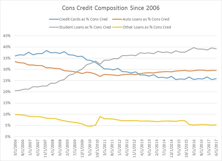
Over the last year, 3-month T-Bills and 2-year Notes have both gone from up about 100 basis points.  In theory, higher interest rates should not be good for stocks.  Higher rates curb economic demand and therefore sales growth and ultimately earnings growth, and simultaneously raise the cost of corporate borrowing which funds earnings.  And when you look both in the US and across a large swathe of developed countries, this relationship holds.  Put another way, the prospects for positive equity returns for the next 1-12 months in the US, if 1 year interest rate changes are your only guide, is negative.

Since 1960, annual changes in 3-month T Bills greater than 1% (with the annual change from the prior month being less than 1%) have occurred 21 times, using month-end data.  One year changes greater than 1% for 2-year notes have happened 28 times over the last six decades.  The first chart shows what equity returns look like, on average, in the next year after this rate increase.  Results over the next year are negative with most of that decline occurring in the first 5 months.  While this does not mean equities can’t go up in the US, it does mean that the statistical odds favor a decline.

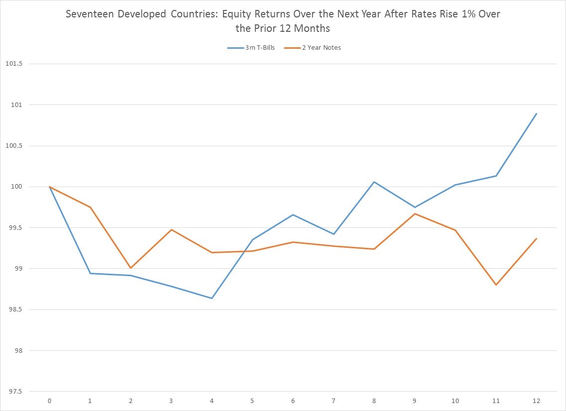
When you look at a much larger set of developed countries, the same relationship holds, only the statistical evidence is that much stronger (as you can see in the next chart).  Over the last 6 decades, a +1% annual jump in rates has happened 258 times for 3 M bills, and 208 times for 2 year notes.  As in the US, most of the negative returns occur in the first few months.

If the recent 1% annual jump in US rates is negative for domestic stocks on an absolute basis, the same is not true in the rest of the developing world.  Only Canada, where annual changes in 2 year note recently passed above 1%, has seen rising rates on the same scale as the US. Outside North America no major developed economy is seeing rate hikes this quickly (some are actually declining), so there is a strong case selling North American equity in favor of other developed equity markets over the next few months.

Please follow and like us:

Something to Think About: On Chinese Trade Wars and Inflation

Ignoring the inflationary pressures that come from an immigration policy bent on constricting the supply of domestic labor in an already tight labor market, and the consequences of ballooning public sector spending on higher interest rates, and consider for a moment what trade means to the US economy.   Depending upon the year, imports range from about 13-17% of total US gross domestic product.  We import a lot of stuff from Asia and especially China, because it’s cheaper to make there.

We do this for a reason.  Trade is not a zero sum game, but a win-win for both parties, thanks to the economic concept of specialization.  You can make something, say iphones, better than me. And I, in turn, can make something better and cheaper than you, say soybeans. And we exchange one good for another to live richer lives.

Since July of 2008, imports from Asia have grown 30% and imports from China have grown 56%. Over that same period, US consumer prices have risen a mere 13.2%, which is pretty subdued. One of the contributing factors to keeping US inflation so low has been deflation in Asian import prices.  Since July of 2008, imports from Asia have risen 30%, while prices for these imports have FALLEN 36%. Let’s repeat that.  The value of all imports from Asia is up 30% while the prices of those imports is down 36%.  In other words, as US consumers of imports over the last ten years, we have gotten more and more services and goods and paid less and less for them.  A trade war with China, which represents about 47% of Asian imports, would completely reverse this trend, eroding US purchasing power, especially for goods, and put upward pressure on inflation and therefore interest rates.  So while tariffs on Chinese imports may just be a posturing gesture in the art of a deal, should those tariffs become reality, the economic and financial consequences could be fantastically ugly.

Please follow and like us:

Something Scary in Consumer Credit Growth


With the exception of a few anomalous periods, consumer credit has pretty much always grown (as you can see in the first chart below).  Not shockingly, it actually contracted briefly during the crisis of 2008, as households cut back.


When you look at longer-term growth rates in consumer credit, things look fairly normal.  We are not near historic 5 year growth rate lows of 10%, like we were in the crisis, or even the 20% lows we saw in the early 1990s.  Consumer credit 5 year growth is hanging in there around 30%, which is historically a little on the low side, but not terribly so.

Dig a bit deeper beneath the surface, however, and you do see two interesting recent trends.

First, the government has become a major player in consumer credit markets, especially since the financial crisis when risk averse financial institutions became much stingier.  Below is a chart of the composition of who is lending to consumers by institution type.  Banks have always been, and continue to be, the largest providers of consumer credit.  Historically, they have provided 50-60% of consumer funds, though that has dipped closer to 40% since the mid 90s.  Financial companies and credit unions show some variability through time, with financial companies seeing a 10% decline in their share of the lending market since 2010.  But by far the largest change, and the one most worrying if you are a believer in free markets, is the huge jump in the presence of the government in providing credit:  the government is now close to 30% of the consumer credit market now vs. 5% ten years ago.  This is almost entirely a result a second secular trend in the credit markets—the explosion of student debt.

If you look at a longer-term historic chart that breaks down what types of consumer loans were taken, you don’t get a ton of insight because student loans have only been broken out by the Fed since 2006.

What’s interesting is how credit card debt was fairly non existent in the early 1970s at a mere 5% of consumer debt and ran up to 40% in the late 90% and has since come back down closer to 25%.  Car loans, by contrast, have been pretty steady at 30% of total consumer credit.

It’s only when you look at a breakdown of consumer credit since 2006 (when the student loan data becomes fully available) that the changes in US consumer debt composition become so obvious.  As you can see in grey line in the chart below, student loans have moved from 20% of all consumer credit in 2006 to close to 40% now to become the largest percentage of all consumer credit.

The government’s increasing market share of consumer credit is directly tied to the rapid growth in student loans.


The problem is that, in the long run, the growth rate in student loans is utterly unsustainable.  There is too large a gap between the higher growth rates in student loans and lower growth rates in household incomes.  As we learnt from the last crisis, there is only so long that debt growth can outrun income and asset growth.  If borrowing growth exceeds income growth, debt payments either cannot be made and we get defaults, assets have to be liquidated to fund debt payments (young people out of school however have no assets), or students will have to go to family to fund their debt.  None of this is good for consumption or the growth in earnings of companies are tied to younger consumers.

At some point either student loans growth will have to slow, or these loans will have to be written down.  This may or may not be a “credit bubble” since bubbles typically require some leverable asset that increases in value, but nomenclature aside, at some point there will be reckoning.


Please follow and like us:
RSS
kent969@yahoo.com
LinkedIn
Share