A Look at The Growth of ETFs

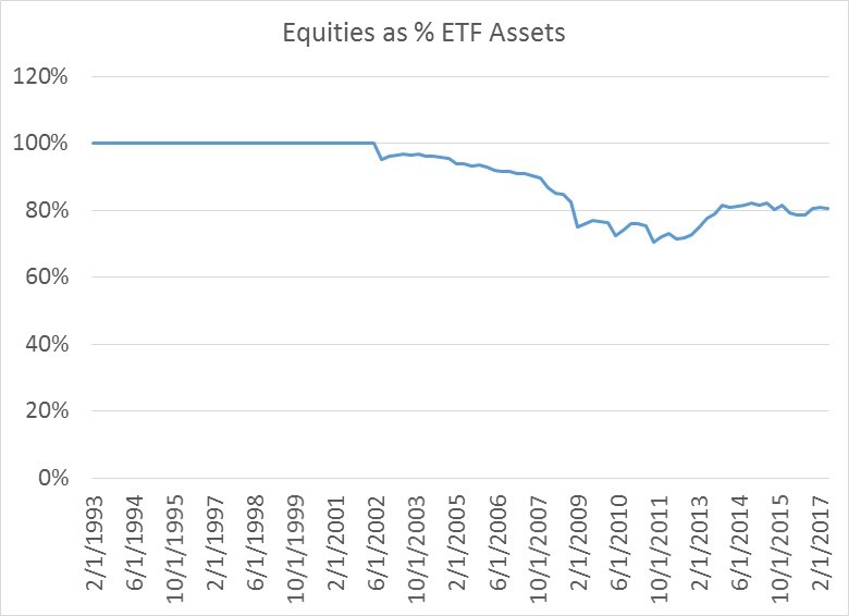
The popularity of Exchange Traded Funds (ETFs) started in the early 1990s as an alternative investment vehicle to Mutual Funds.  The first popular ETF, the SPDR S&P 500 (Symbol: SPY) provided investors with inexpensive exposure to the S&P 500 Index.  Since that time, ETFs have grown and grown in usage.  What is interesting is that despite their proliferation, the majority of ETF assets have been and remain in equities, as you can see in the first chart.  For the past decade about 80% of all ETF assets have been in stocks.

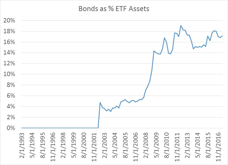
The only asset class that has really begun to crowd them out is bonds.

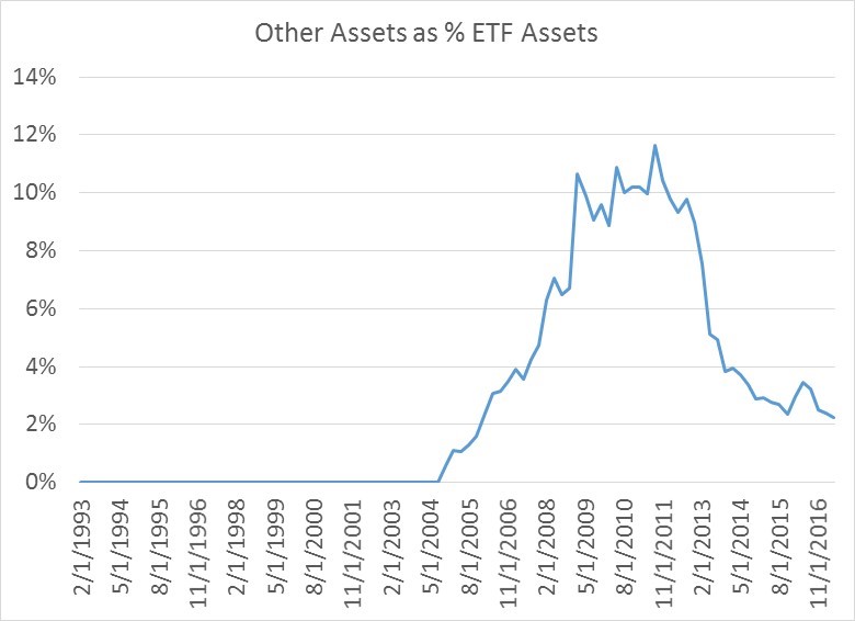
Other investment asset classes and investment alternatives (commodities, currencies etc.) made a decent in-road to total market share from 2008 to 2012 for a period of time, but have since seen their market share decline.

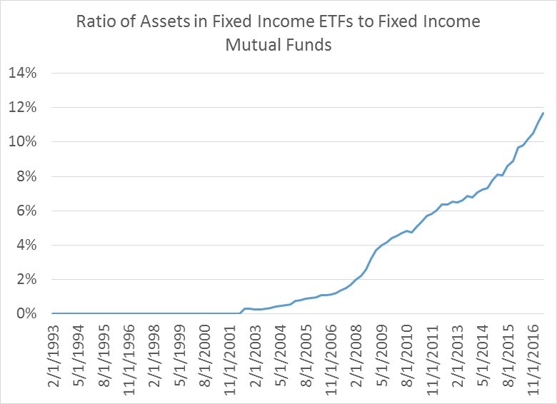
When you look at the market share that ETFs are taking away from Mutual Funds, which on average have loads and much higher fee structures, the relative growth in assets makes sense, especially since many, though not all, ETFs are indexes and not actively managed.   That said, there remains plenty of room for ETFs to take greater market share across all asset classes.  The first chart below shows assets in Fixed Income ETFs relative to Fixed Income assets in Mutual Funds.  Fixed Income ETFs have doubled their market share from 6% to 12% over a five year period, but there is still plenty of market share capacity left.

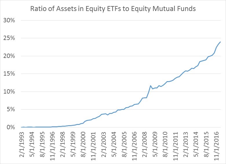
The same story holds for equities. Equity ETFs are now almost 25% the size of equity Mutual Funds.  This number has doubled over 10 years.

The growth differential between funds flowing into equity and bond ETFs and those flowing into Mutual Funds remains sizable.  Both Fixed Income and stock ETFS are growing 20% faster than Mutual Funds in terms of annual asset growth.

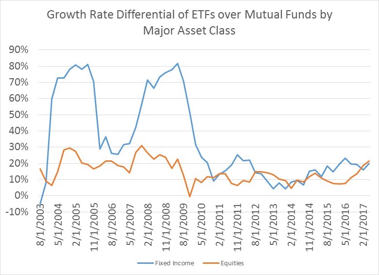
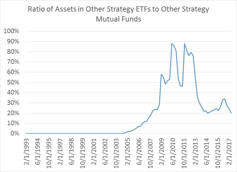
The one area where Mutual Funds still predominate, for the time being at least, is outside of equities and bonds.  The majority of non-equity and non-bond assets was actually mostly in ETFs in 2010-2011, but has since moved into Mutual Funds.

I doubt this will continue as the demand for non traditional, alternatives to stocks and bonds grows.  Bond yields remain awfully low and equities remain toppy, and the need for investors to find effective diversifiers at minimal cost will eventually drive the creation of low cost ETFs that provide low correlation products to the end user.  If we ever get a bear market in stocks again (believe it or not it can happen), expect a boom in the Alternatives ETF space.


Please follow and like us:

Debt and the State of US Households

Since the asset market crash in 2008, US monetary policy has been partly geared toward repairing domestic household balance sheets saddled with mortgage debt. Household liabilities, i.e., mortgage debt, needed to be brought back in line with the incomes and the assets that service that debt with sufficient monetary force to avoid the Depression. Not shockingly, the Fed dropped interest rates to zero and purchased assets like mad to keep the economic engine moving.

To a large extent, the Fed has now accomplished this goal. Households now have a lot more (low yielding) cash than they do mortgage debt, as you can see in the charts below. If US Households pooled their funds in aggregate they could simply repay all of their mortgage debt in one fell swoop by wiring money out of their bank and money market accounts.

Looking in more detail…

After being fairly steady from 1960 to 1988 at a ratio of around 60% mortgage debt to cash, households went on a borrowing binge for the next twenty years ending in 2007. Since 2008, that borrowing binge has been slowly rectified, as household mortgage debt peaked in the second quarter of 2008, and simultaneously household holdings of cash have steadily grown, such that ratio is now safely below 100% (its currently 88%). While not as modest and debt-light as the 60% level we saw in the 1960s, when all is said and done, households look to be in better financial shape now.

(Data source: US Federal Flow of Funds data for this all subsequent charts)

Not everything is rosy, however. We are simply using cash here as a proxy for liquid assets and ignoring holdings of stocks and bonds. When measured in this somewhat narrow way, total liabilities of US households remain fairly high. Again looking back at the prudent period before 1990, the ratio of total liabilities to cash was safely below 100%. That number peaked in 2008 above 200%, and lies around 135% now. This is a massive improvement, but it leaves some room to go, since household liabilities still exceed cash holdings.

Additionally, the ratio of non-mortgage debt relative to mortgage debt for US households has been steadily rising since the peak in crisis as households have taken on more consumer credit debt: mortgage debt has contracted by $814 bn since the first quarter of 2008, while consumer credit has grown by $1.094 trn. For context, over the same time frame, cash has increased by $3.511 trn. So the increase in consumer credit through this lens is modest.

For the time being at least, these decade long trends look set to continue, though its quite possible that some of the household debt composition numbers may begin to shift in the coming years. Housing booms in certain cities and in California, if they get too out of hand, may increase household mortgage debt again. But in a broader sense, the balance sheet repair that was necessary after 2008 has to a large extend been accomplished.

Please follow and like us:
RSS
kent969@yahoo.com
LinkedIn
Share